Cigna Healthcare
Management Operating System Application: UX/UI, Product Strategy, Design System, Ideation Facilitation
The Cigna Group is a global health company committed to improving health and vitality. They’ve relentlessly challenge themselves to partner and innovate solutions for better health.
Their global workforce of more than 70,000 colleagues work through Cigna Healthcare and Evernorth Health Services to fulfill their mission to improve the health and vitality of the more than 190 million customer relationships we serve in more than 30 countries and jurisdictions.
Cigna Healthcare is the health benefits provider that advocates for better health through every stage of life. They guide their customers through the health care system, empowering them with the information and insight they need to make the best choices for improving their health and vitality.
Evernorth Health Services creates pharmacy, care, and benefits solutions that improve health and increase vitality. They relentlessly innovate to make the treatment, prediction, and prevention of illness and disease more accessible to millions of people.

Results & Outcomes
• Structured the product requirements;
• Clear AI focused UX design process and team facilitation;
• Validated our Design Decisions through Usability Testing;
• Developed the visual identity for the product;
• A coding-ready web app, with react components, designed from scratch;

Process
1. Gathering Requirements
At a very early stage of product development, was to prepare for the 6 month window we had to complete the ux design process of the Moanagement Operation System application. So, we started gathering feedback via daily session (design sessions, planning meetings, strategy meetings and feedback sessions). The project was split into a few phases, the first of which involved the following functionality:
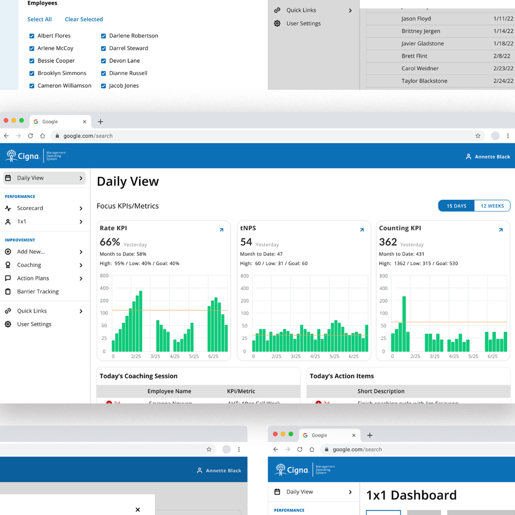
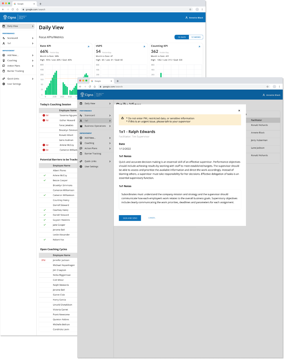
• Ability to have daily view home page and add tasks, view performance;
• Go to Scorcard page view health of performance of frontline workers;
• Ability to add new coaching sessions, and action plans;
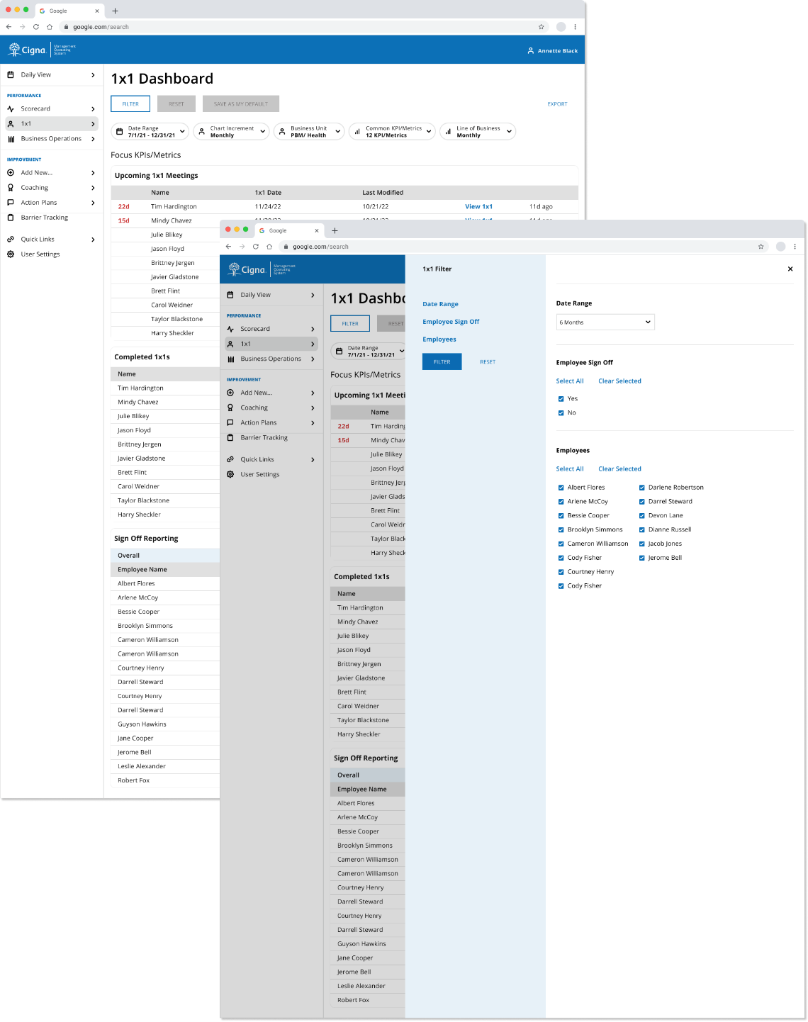
• Schedule, facilatate a 1×1 meeting(s);
The list of the aforementioned features was provided by the product team.
Conducting a UX workshop
In order to get on the same page on the key aspects of product design, such as success criteria, team structure, and product vision, we conducted a UX workshop.
Before moving on to wireframes, we’ve identified our key design priorities, which included:
• Building trust.Therefore, it was our priority to demonstrate how the data will work to tell the users a digestible story to help understand their business success.
• Making web app usage intuitive.
• Setting the right expectations.
Below, you can see the solutions we’ve brainstormed to the aforementioned challenges.
2. Brainstorming and Wireframes
Based on the requirements and the initial workshops we conducted, we started working on visualizing a rough web app structure, i.e. moodboards and wireframes. We then iteratively moved from rough sketches to high-fidelity wireframes, thereby aligning our design vision among the key stakeholders.
Moodboarding
Having roughly outlined the MVP we were going to build, we’ve decided to closely monitor what the market currently has to offer. That said, we’ve categorized all prominent available tools and the features they offer.
Wireframes
Based on the documents we were provided with, we’ve turned the list of features and requirements into user flows & wireframes to validate the logic behind the flow. Having reiterated a few times to address some of the initial design issues, we developed early stage wireframes that were ready for early usability testing via in-house users to assist gathering feedback.
Information Architecture
After the ideation workshop, we started working on the Information Architecture of the application, based on the features defined.
The process consisted of proposing a navigation structure through a product map and layout options based on wireframes. We also proposed a user flow for the first part of the new user experience, the utilization of the web app, through a series of steps to collect the necessary data to present users in the app.
3. Design System/Component Library
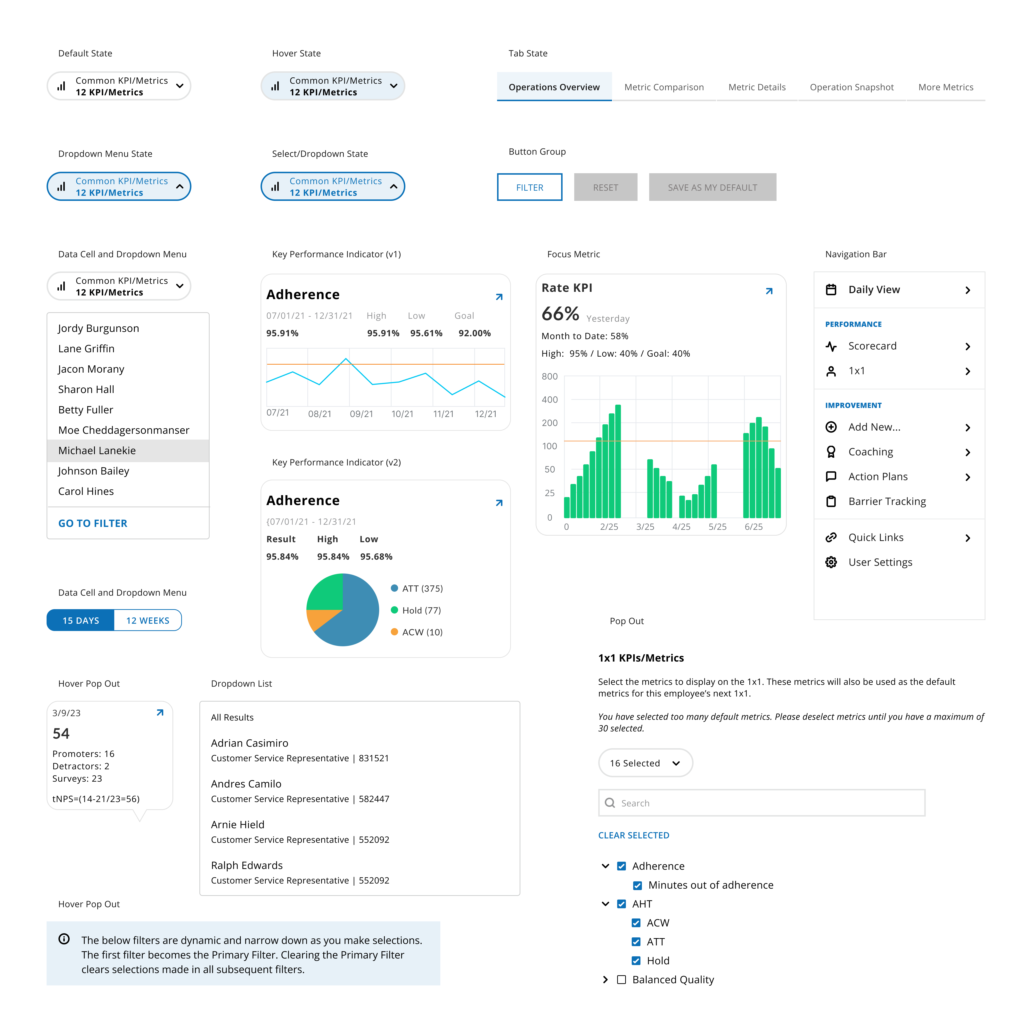
Even though Cigna Healthcare had an established, well-defined design system and component library – throughout the ux process we needed new variations of existing components. Once, those new components were created we then communicated, walked-through use cases and finalized/approved with the design team to implement into design system and component library

4. High Fidelity
After going through our ux process, we produced well-defined high-delity designs. The goal for the high fidelity designs even after a step of user research, prior, via design session is to allow us to create a prototype version to test, gather feedback and implement feedback post release then iterate. Until the design reflected users needs and met the stakeholders vision, then proceeded to refine and polish the designs until their completion.


Conclusion
The finished product led to a new web application with more features to utilize not only for managers but the frontline workers. The was the first project we both designers had to complete a full ux process and deliver in a 6 month timeframe. This allowed not only us as ux designers to push ourselves but our product team to research, strategize, design and implement a well-functioning web application. Also, fill the backlog for development, which included – enhancements, future feature(s) and concepts.
This project validated the value of what a team can do. We centered the product around our core user based, which should be implemented in all products, and executed the plan we developed while maintaining quality. Developpment, after the 6 month process, continued to empty the backlog and release features with versioning system on a weekly basis.