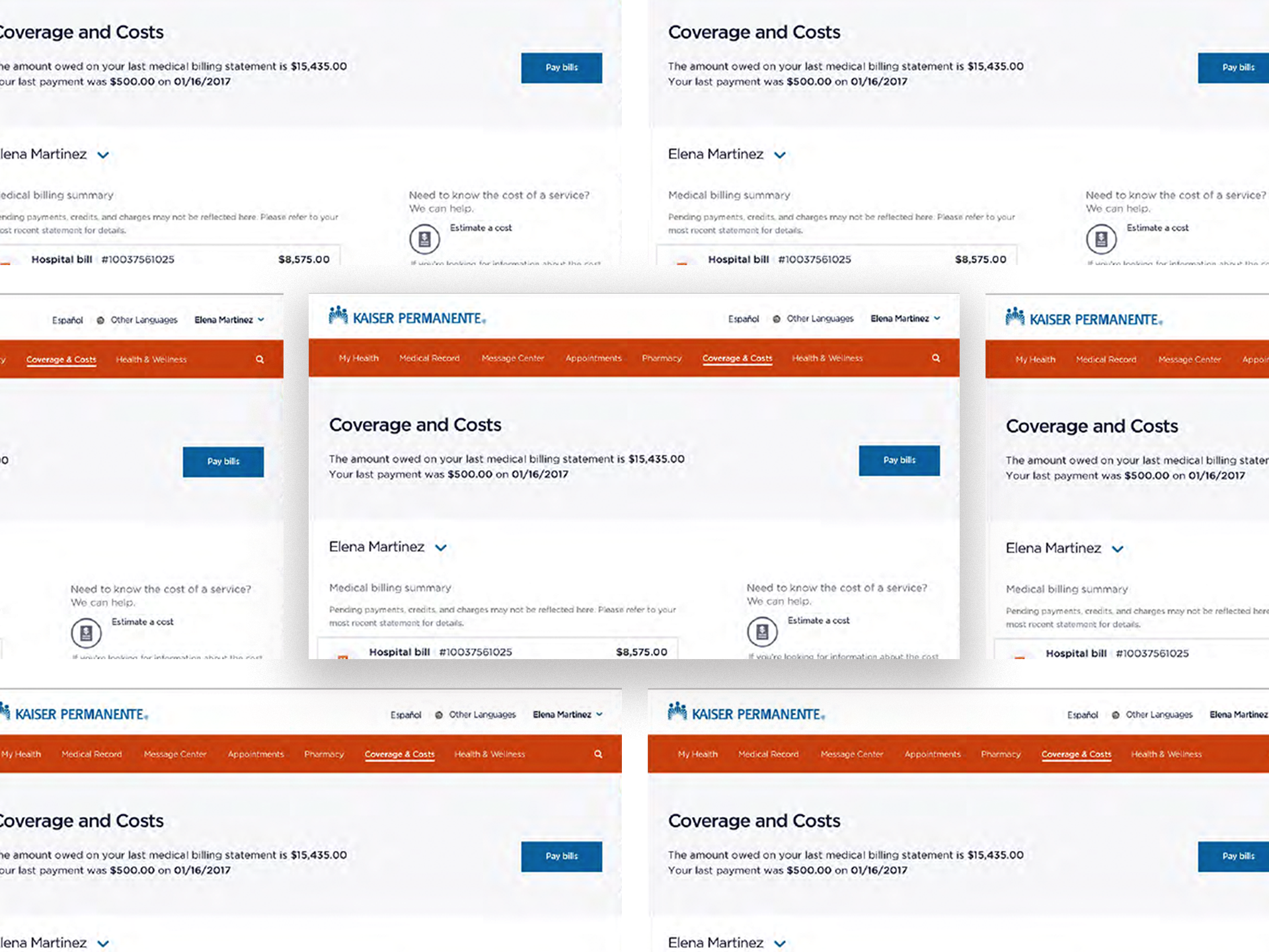
Kaiser Permanente
My Cost and Coverage Application: UX/UI, Product Strategy, Design System, Ideation Facilitation
Kaiser Permanente exists to provide high-quality, affordable health care services and to improve the health of their members and the communities we serve.
Founded in 1945, Kaiser Permanente is recognized as one of America’s leading health care providers and nonprofit health plans. They currently serve members in 8 states and the District of Columbia.
Their care model enables our teams to think and work as one, coordinating your care seamlessly, so you don’t have to — and delivering better care when it matters most. Their members have access to care from Kaiser Permanente health care professionals by phone or video 24/7.
Care for members and patients focuses on their total health. Permanente Medical Group physicians, specialists, and teams of caregivers guide all care. Their medical teams are enabled by industry-leading technology and tools for health promotion, disease prevention, care delivery, and chronic disease management.

Results & Outcomes
• Increased users’ trust, in the MCC platforms billing process;
• Able to retain current users, which resulted in an increase of the marketing budget to acquire new customers and confidently scale;
• A coding-ready web app, with react components, designed from scratch;
• Clear medical billing focused UX design process and team facilitation;
• A developed brand aesthetic.
My Role
Kaiser Permanente, collects medical billing information from physicians and sends it to insurers for payment. They hired me to redesign its billing experience in early 2014. At the time, its physician clients were accustomed to filling out paper bills—comprehensive forms that include diagnoses, procedures, and insurance claim codes.
To increase the speed and accuracy of its claims process, company leaders wanted to entice physicians to submit online bills (called e-billing) through an existing physician portal, but the physicians resisted. They continued mailing paper forms to Kaiser Permanenete, where billing specialists entered the data manually before submitting claims to insurers.
Doctors are notoriously wary of new technology. Security, productivity, and affordability concerns cause physicians to cling to familiar methods and tools. My mission was to reimagine the existing medical billing software and make it user-friendly that physicians would happily abandon their paper bills.

As a UI/UX designer who, fully experienced in consumer-facing products. I take ownwership in humanizing digital experiences. Within a year, I worked with Kaiser Permanente to update the billing system, and add components to an already established component library and style guide to accompany it.
With two UX design , our process started with research and brainstorming. Then, I created an information architecture and designed a low-fidelity prototype using wireframes before moving to high-fidelity prototyping.
Process
1. User Research
Personas
Together, we created three detailed personas:
Dr. Bellflower: This doctor, on a daily basis, fills out forms with the same handful of diagnoses and procedures. On the e-bill, he must have easy access to his most commonly performed procedures. Forms need to be mobile-friendly, as Dr. Bellflower spends a lot of time traveling between hospital floors and medical facilities, and is often without computer access.
Dr. Hutchinson: This physician runs a small office and usually works with a nurse or an assistant. In his analog workflow, an assistant prepares the forms with the patient information, and he only has to fill in the procedures performed during the visit.
Dr. Overair: This doctor is akin to a small-business owner; she runs a medical office and employs additional physicians. A staff doctor fills out a portion of the paperwork, but Dr. Overair is ultimately responsible for collecting payments from insurance companies.
Feature Analysis
Kaiser Permanente new medical billing experience had to be intuitive, such to a degree, users would view it as a timesaver and assist with aleviating the complexity of existing physical process. With that being said, I began competitve reasearch and utilized several businesses to kick-off process. Such as a financial company (not to be named), below:
It keeps users focused on one task at a time. For instance, it typically asks only one question per page, such as “Did you sell any stocks, bonds, mutual fund shares, or other investments?” and provides simple “Yes,” “No,” and “I don’t know” buttons. Rather than overwhelm users with a lengthy form, company (not to be named) workflow is divided into categories, such as wages/income and deductions/credits. It also shows progress and sets expectations for what’s next—for instance, letting users know that upcoming questions will deal with annual earnings.
It provides side-by-side views. Users fill out a working area on one side of the screen while seeing an overview on the other side. The overview also serves as a menu so users can navigate to various sections.
Sitemap
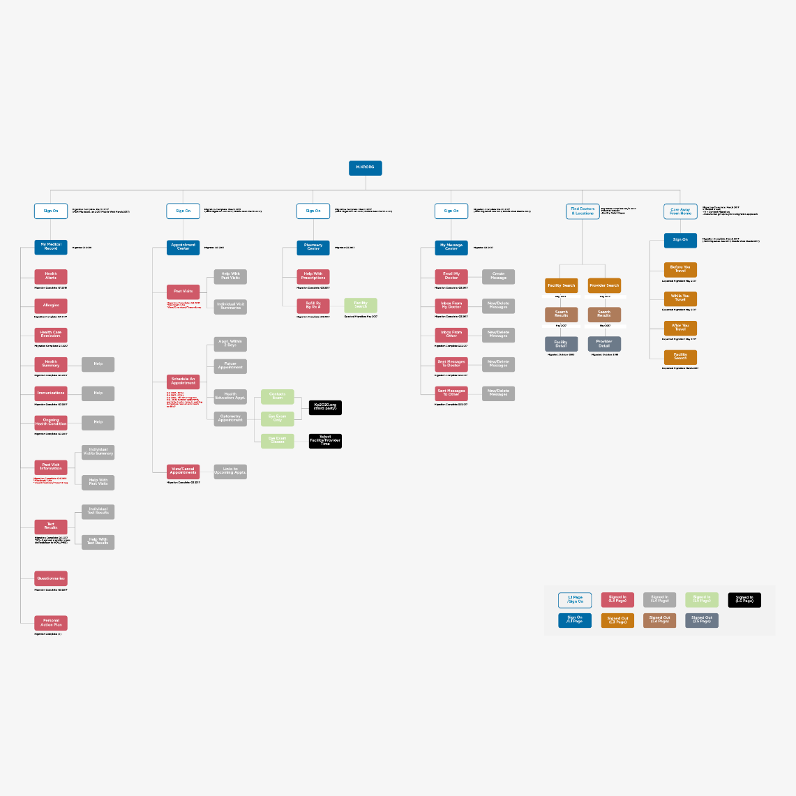
We created a sitemap, collaborating with the design team, to visualize how individual webpages or site sections are related together for the business team to understand how users navigate through the website. We wanted to make sure they understood the relationship to eachother showing how they’re relationship to eachother and to map back why we made certain decisions throughout the ux process. For a wholesome experience, across not only My Cost and Coverage application but the whole product suite.
Creating a UX sitemap is an important step in developing your online presence. It ensures you’ve covered all areas of your site and helps you think about what needs to be done.

2.Wireframes
Daily Design Sessions
On a daily basis, we have a concepts and alignment meeting with the business. We walk-through new designs that we’ve come up with, walking them through new iterations via webex meetings. Occasionaly, if all members on product team are in-house, then we’ll have design whiteboarding sessions. For this team, daily deign sessions via webex were most efficient to gather quality and efficient feedback. The client will either say “Hey, I don’t like it” or “Oh, I love this!” Then they’ll most likely ask if we can change this or that — the design is never final. So we continuously iterate based on client and user feedback. Maintaining a user centric mindset is key here.
We often hand-sketch wireframes, between other designer and myself, before creating digital versions. Luckily, we had a robust design system with a compnent library to plugin throughout the process. However, we had requirements that did not allow us to simply utilize every element in our component library. Since this application, was one of last to be designed we had to create new components with variations of functionality that did not exist, which took more time.
Ideation Validation
We utilized Sketch as our primary ux design tool. Our first iteration of the revised desktop interface had multiple pages: Create e-bill, Reports, Patients, Profile and Pay Bill.
In my proposal, the initial fill form was simple: It asked users to fill in the facility, provider, date, procedure, diagnosis, and modifiers, which offer more information about a procedure. We also implemented a visualization of the paper bill in order to orient users relative to their previous way of working.
When we presented the initial wireframes, the product team mentioned that we needed to allow for additional procedures to be added and that everything had to be linked to a diagnosis, which insurance companies require, so I created a component that enables this functionality (for nda purposes cannot display) .
Prototyping & Usability Testing
In order to validate some of the assumptions we had on specific features, imnteraction patterns and workflw , we’ve conducted a series of user interviews utilizing protypes built by myself.
Component Library
We utilized a component library of pre-built, reusable UI components or code snippets that developers can use to build a user interface. Our library allowed all design team members to keep consistent design patterns and continue to develop our our style guide.
3. High Fidelity
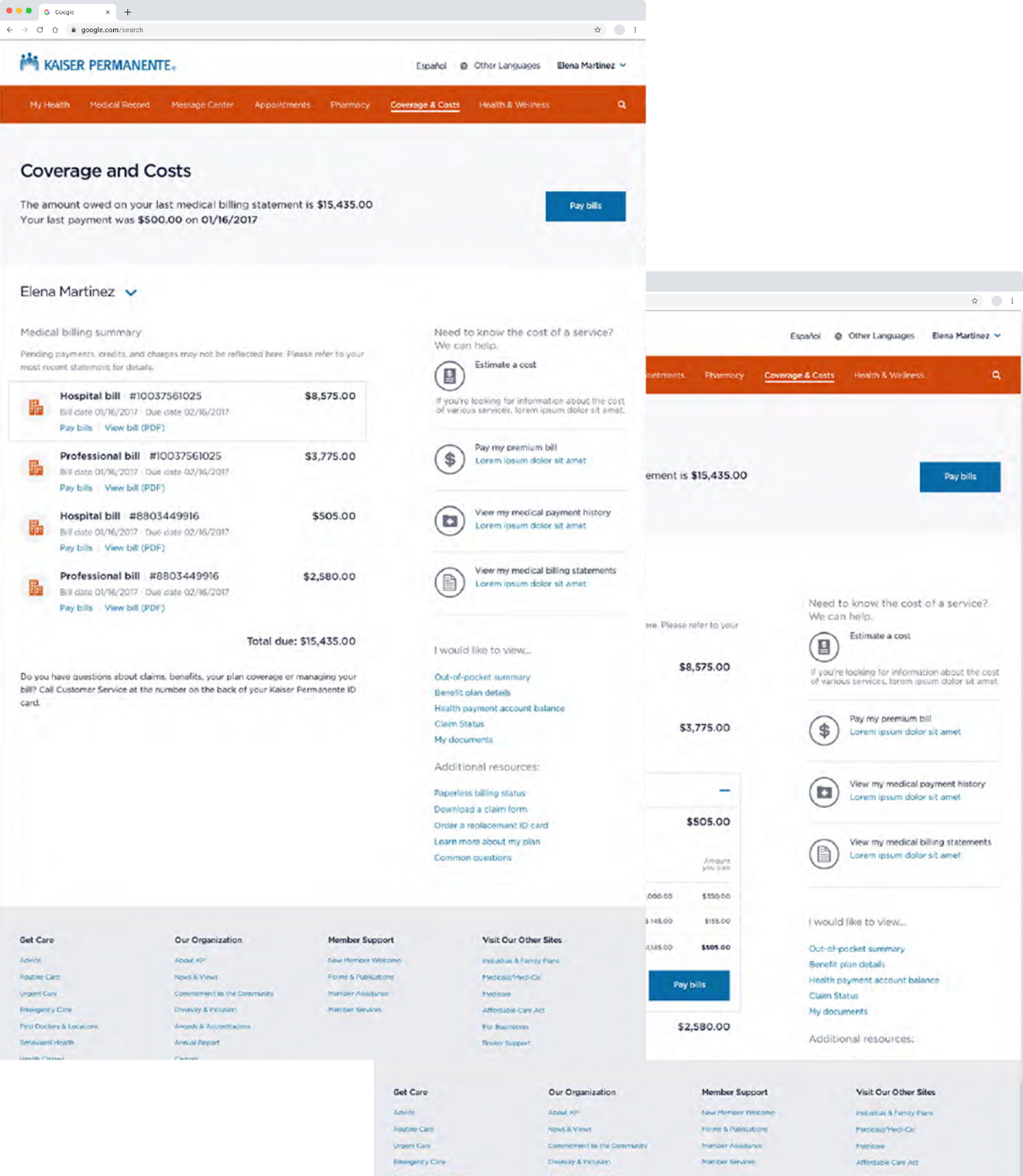
After validating design assumptions, we reached a solid application structure that reflected users needs and met the stakeholders vision, then proceeded to refine and polish the designs until their completion.

Specifications & Documentation
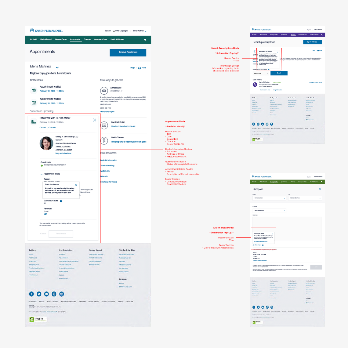
In order to get on the same page with the development team, on the key aspects of product , such as efficient execution of approved designs we created specifications documentations for them to follow.
Below is an example of the level of detail we go into to assist with development implementaion. With that being said, setting right expectations with the development team by assisting them with these documentations it’ll allow them to work smarter and not harder.

Conclusion
Through close collaboration with the product team, we were able to take a detailed document of requirements and turn it into a fully validated design that was ready for coding. The process involved designing wireframes to showcase the layout and functionality of the product, creating prototypes to test the design, conducting extensive usability testing to ensure the product met user needs and expectations, and developing a visual identity that was both engaging and consistent with the brand. This rigorous process allowed us to create a product that not only met the original requirements, but also exceeded user expectations, resulting in a highly successful launch.